timata
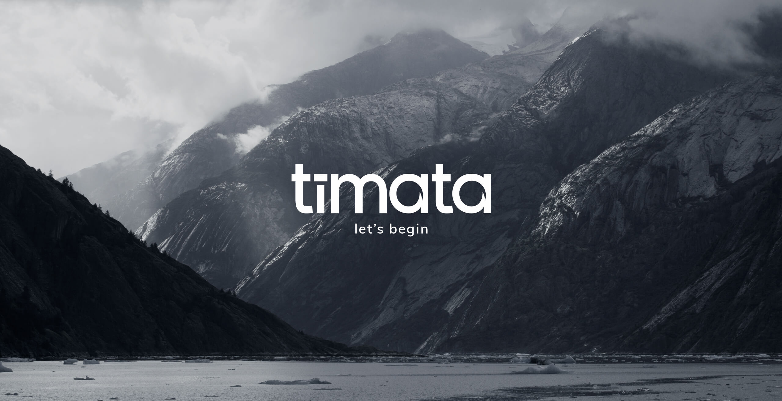
Established in the UAE in 2010 (under the name ‘Circus’), we are a proudly independent agency and remain so to this day. After leaving our first home in DMCC/JLT in mid-2017, we relocated into the heart of Dubai in DIFC, and moving into our 10th year in the region, we decided to give ourselves an update and rebranded as ‘tīmata’.
This showcase aims to explain our process of how we got to where we are today.

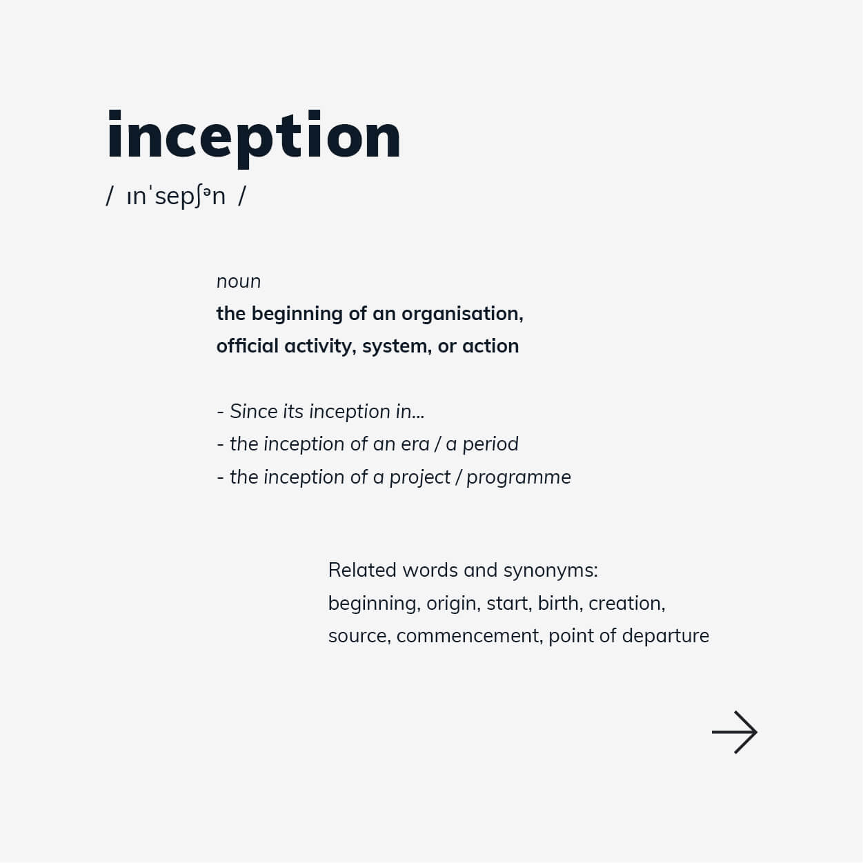
“What are we going to call ourselves?”... This is a huge question as everything starts from here. This lead to 2-3 months of research, looking into multiple themes ranging from quirky to corporate and from science to movie references. Liking the idea that our name would represent the creation of ideas and the start of something, we settled on ‘inception’.
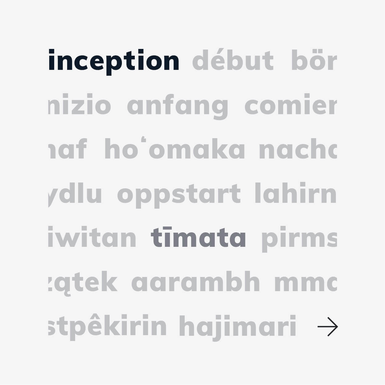
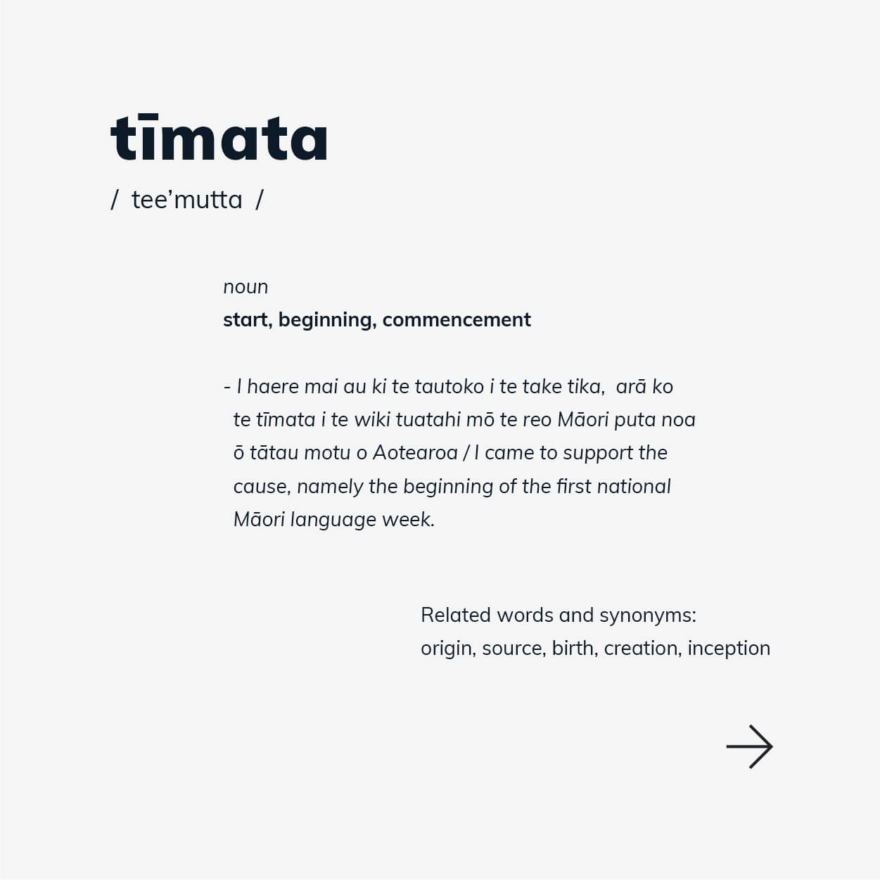
However, we found that ‘inception’ has been over-used in the industry and so we set about looking into the true meaning, followed by related words and synonyms. Running with the theme of starting and beginning, we looked into the variations across all languages. ‘tīmata’ comes from the Māori language, meaning the same.
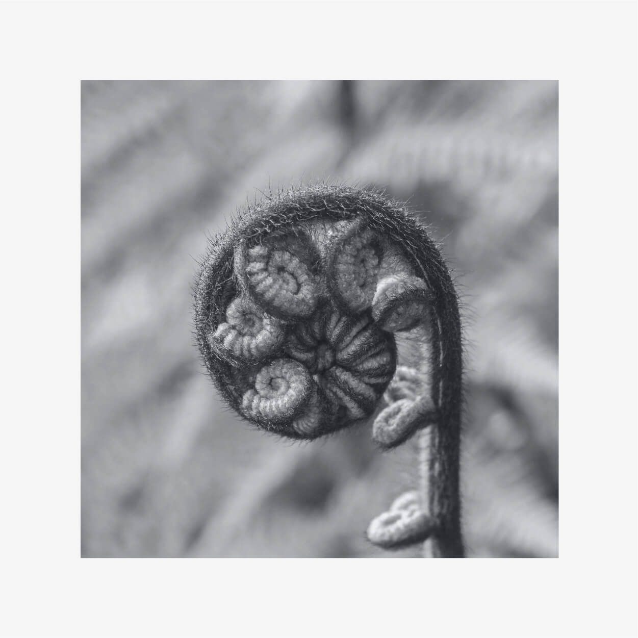
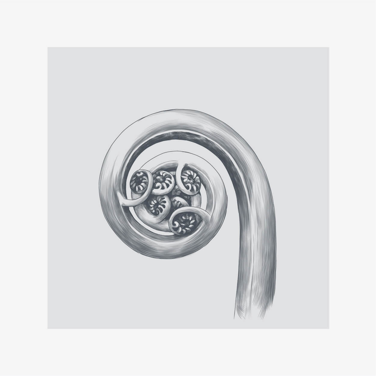
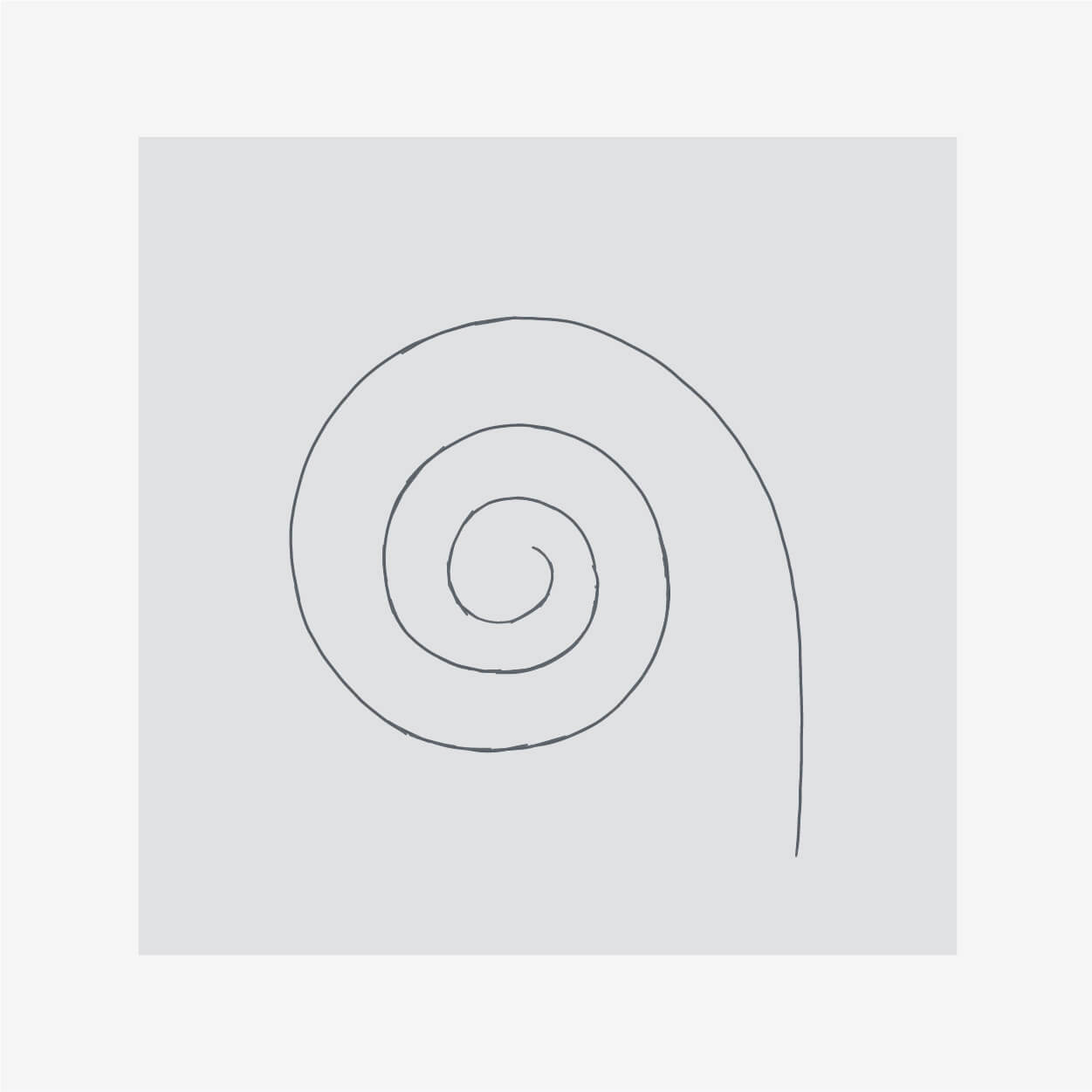
The Māori culture has a wide variety of patterns and iconography that are used in their designs and artwork to symbolise words and meanings. The koru (Māori for '"loop or coil"') is a spiral shape based on the appearance of a new unfurling silver fern frond. It is an integral symbol in Māori art, carving and tattooing, where it symbolises beginnings, new life, growth and strength.
We always knew that we wanted a wordmark style logo, so our task then was to explore how the text could be visualised to portray the feeling of beginnings and possibly include some form of a spiral.
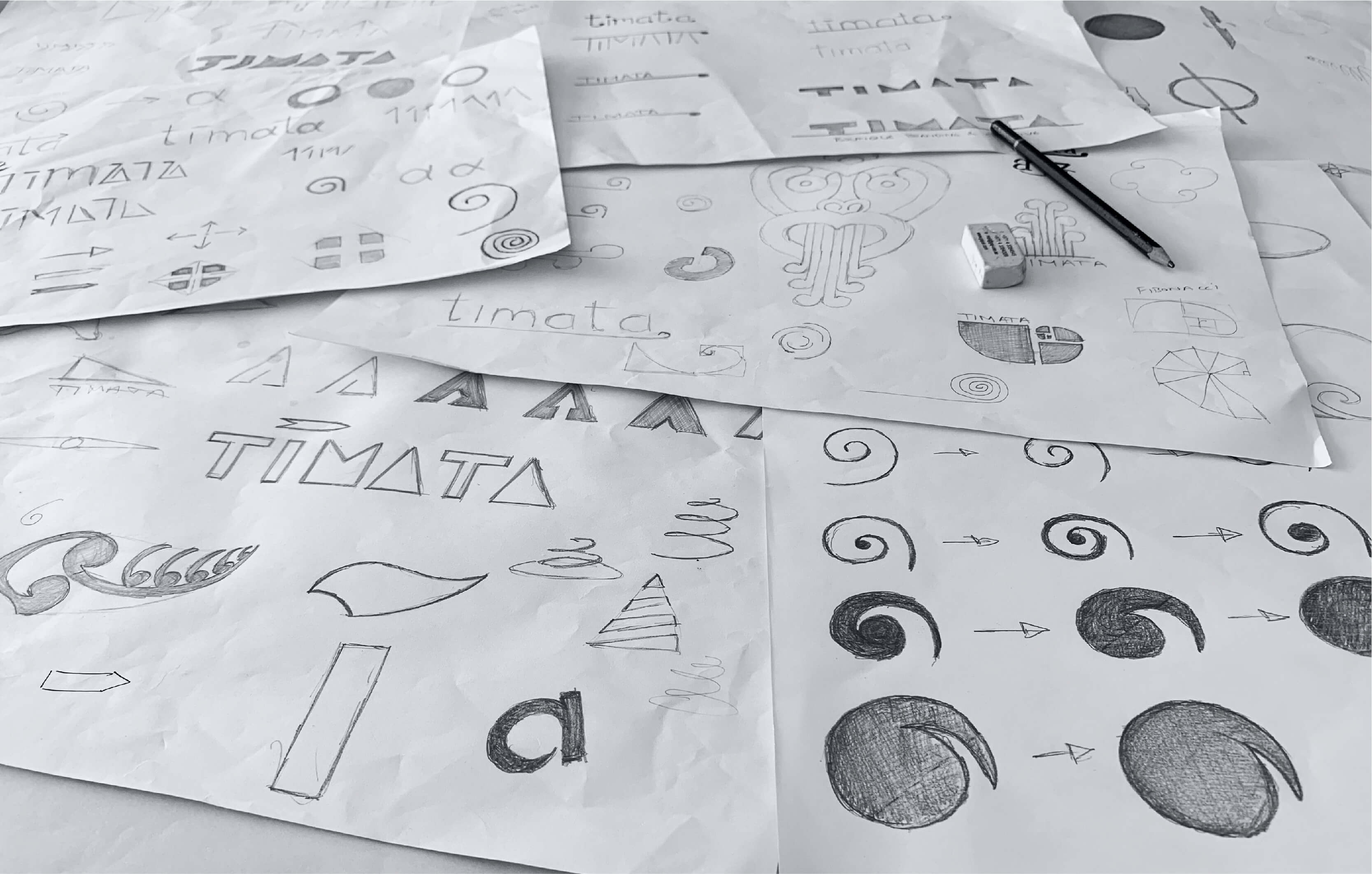
After trying many variations of how to represent a spiral within the text itself, it became clear that the best outcome would be to use a lower-case ‘a’. This also worked to our advantage when trying to keep the diacritical mark (accent) above the ‘i’, as it didn’t interfere with the ‘t’ at the start of the word.
We started by using the bowl of the letter ‘a’ to create a spiral, then pushing it further and back into the stem. The intention of this was to join the bowl back to the stem so that the counter space became a negative of our version of a spiral, which could be taken out from the letter and used as an icon to represent the brand without needing to use the full wordmark.
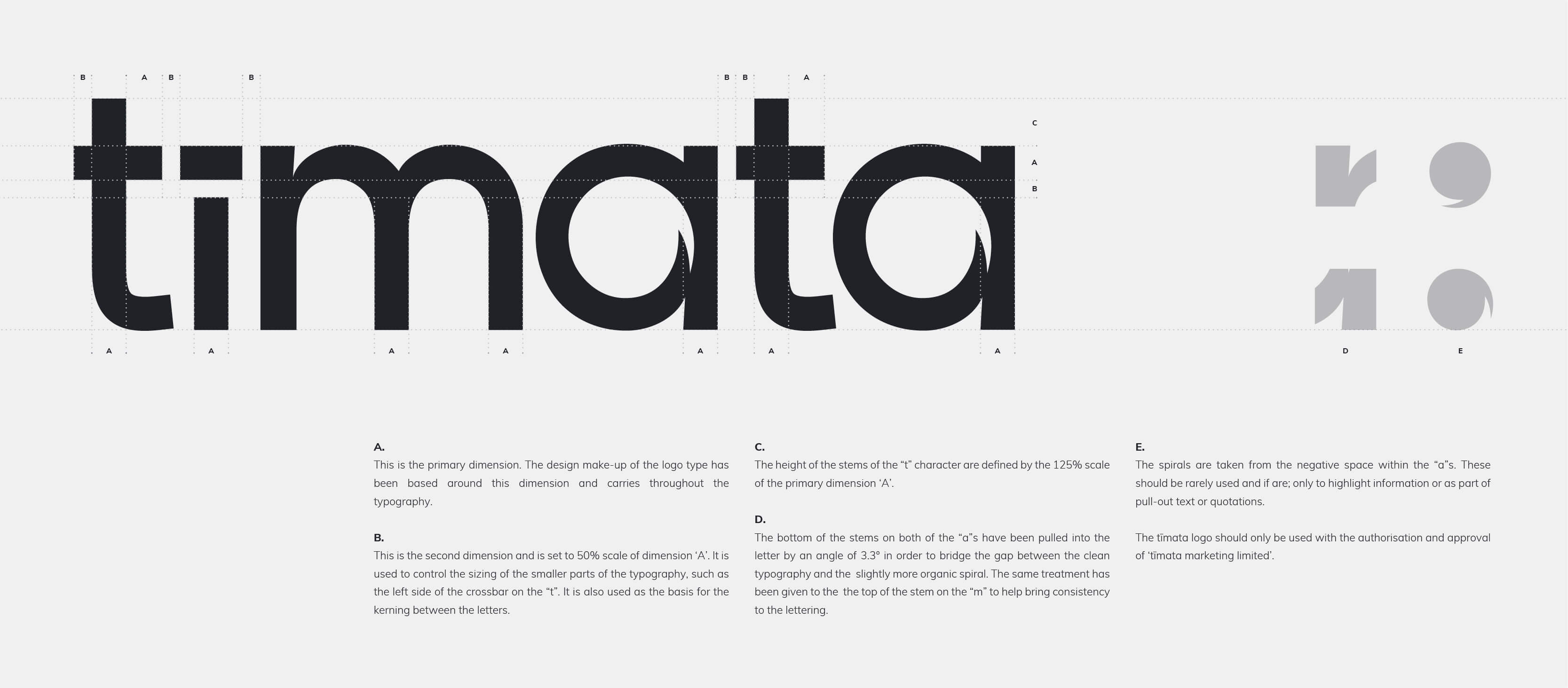
Taking the idea of the unfurling fern further, we wanted to make sure that the brand was able to suggest movement in every instance. We have achieved this by creating a dynamic grid layout which staggers text and images, sometimes overlapping, which also helps to emphasise hierarchy.

As a modern agency, it was important for us to be as digital-friendly as possible. Therefore, when creating colour palettes and fonts, we started with RGB colours first and then moved into CMYK and Pantones for print as secondary variations.
The same theory applied when looking into typefaces. Being a Google font, the Muli font family is easy to use on the web and comes with a wide range of weights to give full freedom when designing brand materials.

We still love working with print and production, but when it comes to our own environmental footprint we want to try to be as friendly as possible. All of our branded stationery has been designed to work best on a digital platform.
With this in mind, we also created digital business cards which can be scanned from any phone or tablet’s camera. The QR code on the business card image prompts the device to open the information in ‘contacts’ and then the user only has to press ‘save’.
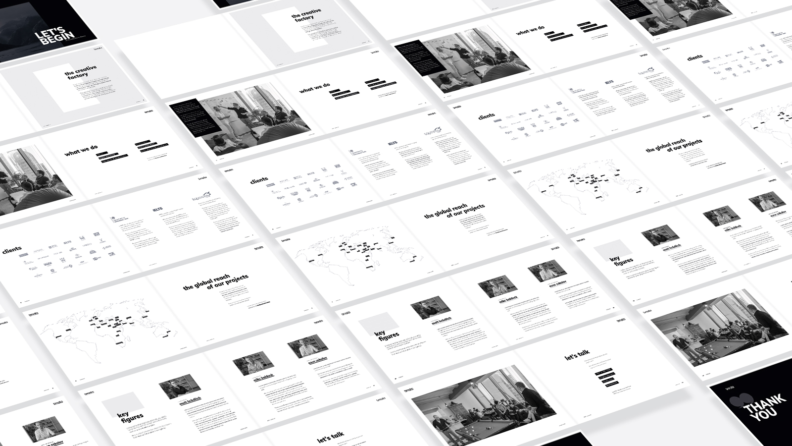
In our never-ending quest to be as efficient as possible, we have created our presentation to be a brief and concise introduction to the agency. The document talks about who we are, our range of services and a few of our clients. For more information, the reader can use the clickable links which directly open the relevant page on our website.
It has been designed to be as light as possible on email accounts but laid out so that it can also be printed in double-page spread format.
