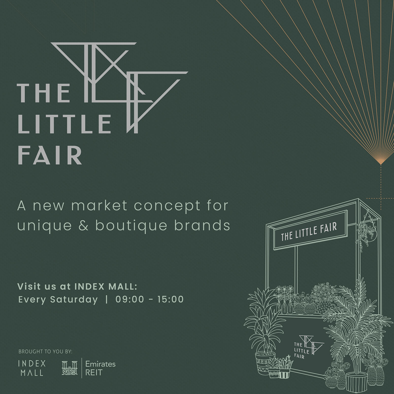
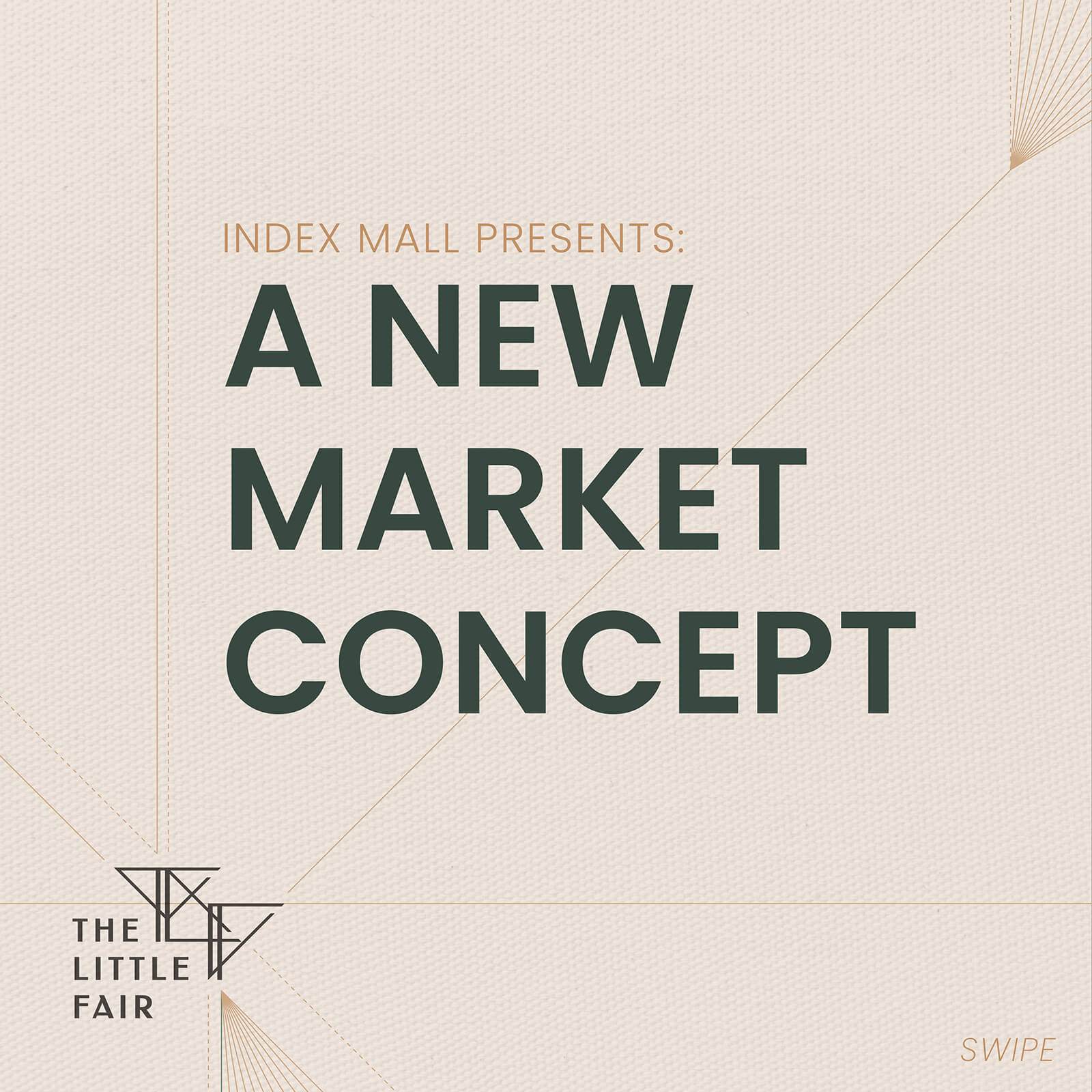
the little fair
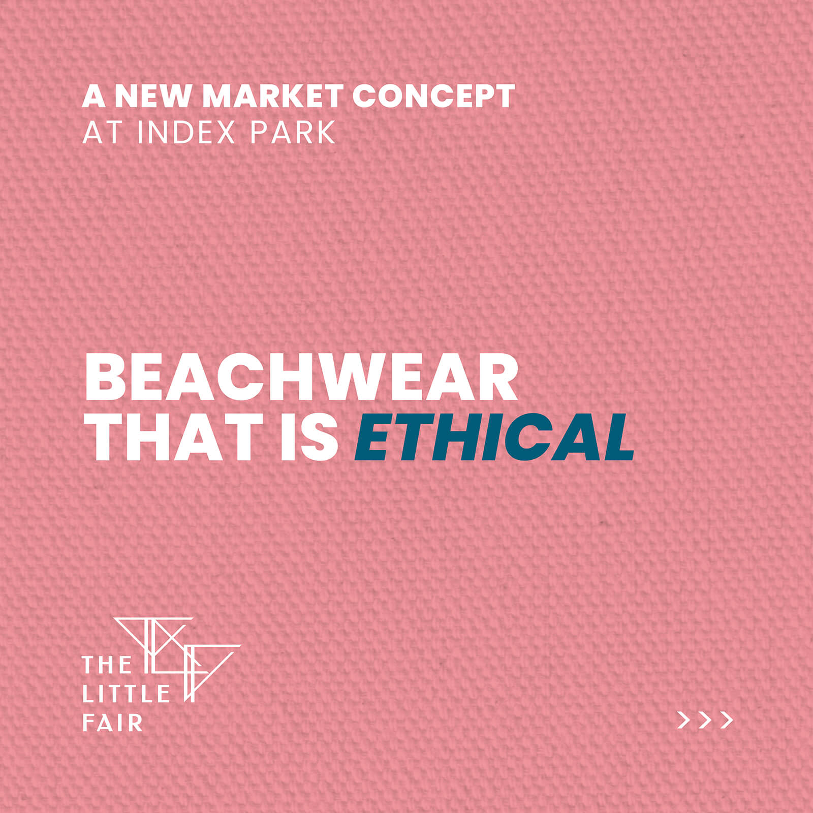
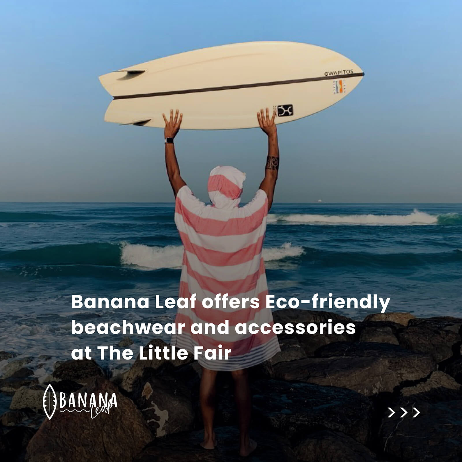
The Little Fair is a boutique market concept. The brand has been designed to be an elegant event specifically supporting ethically created, organically sourced and home-grown brands from around the UAE. The weekly fair brings together some of the most unique vendors alongside varying activities for both adults and kids.
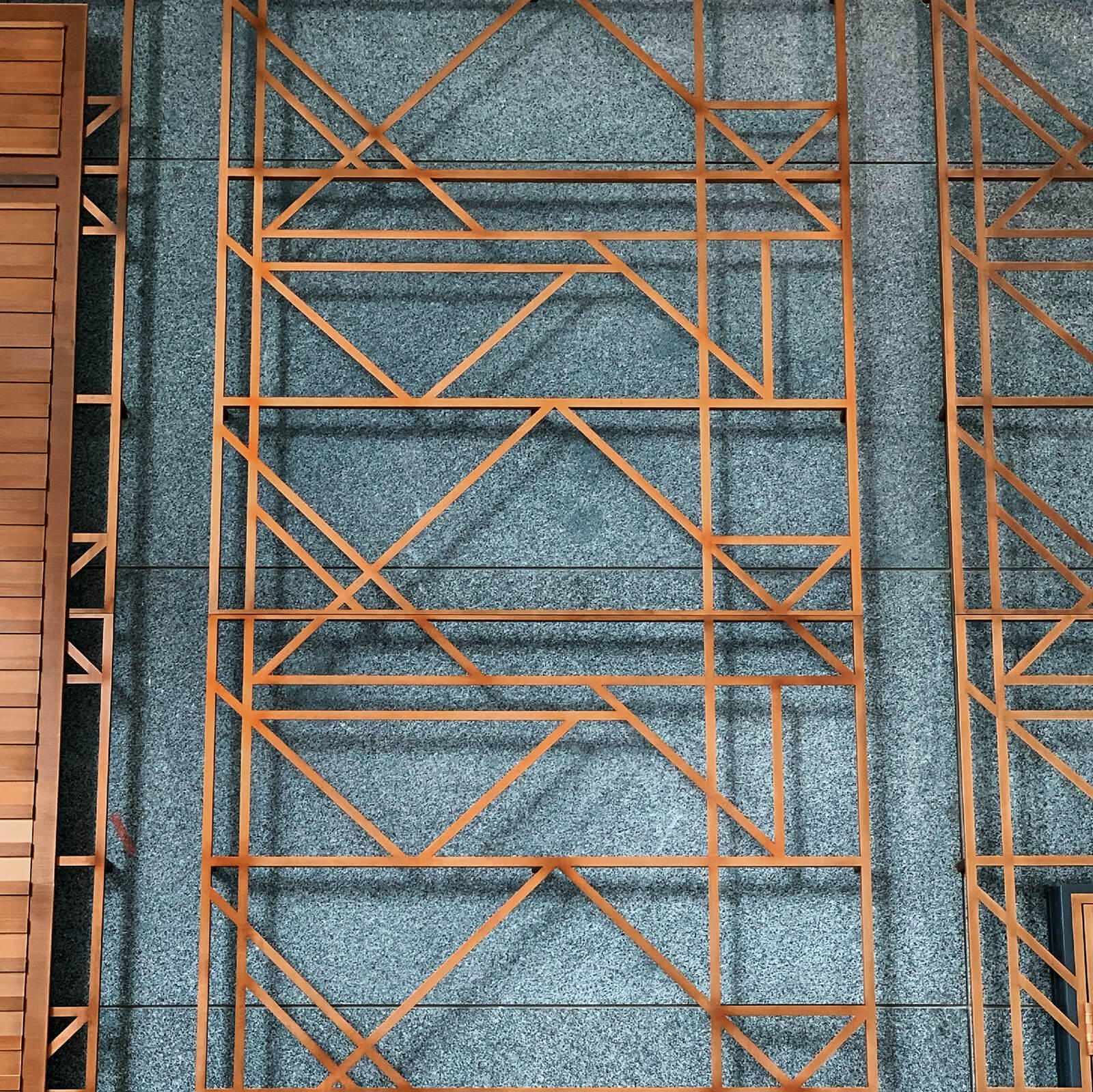
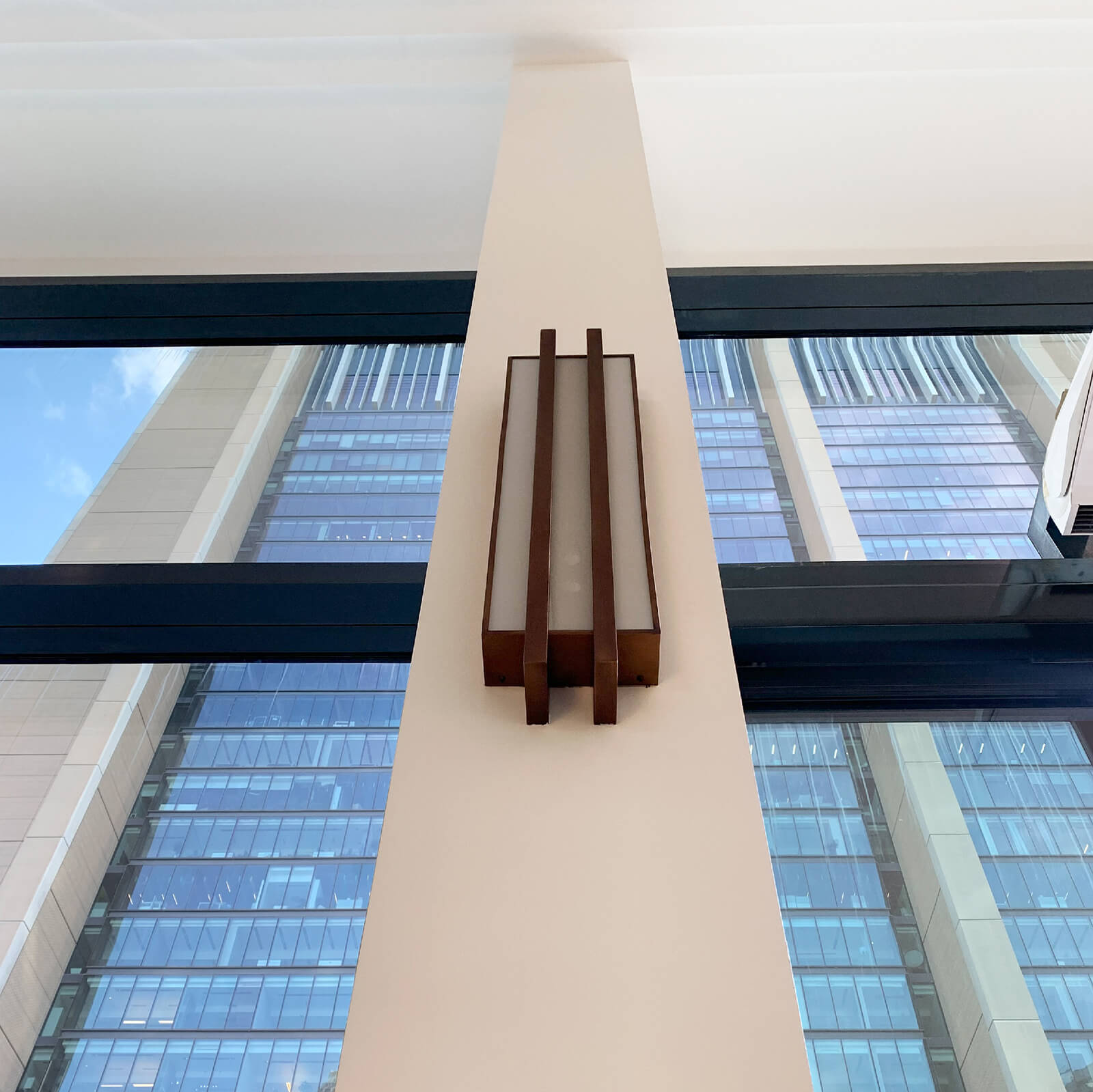
As part of an initiative to better reach out and serve the surrounding community of Dubai International Financial Centre (DIFC), the first fair was launched in the park of Index Mall. Taking the location as inspiration, the design of the concept was heavily influenced by the contemporary Art Deco interiors of the mall, drawing ideas from the lines created by the beautiful marble and brass patterns throughout.
The naming process wasn’t easy. We felt that we had to follow the theme of the Art Deco period from the 1920s, but needed the name to also resonate with a modern-day audience. It had to be based around the idea of a market but also set the concept apart from just any other. After trying many variations as well as language translations, ‘fair’ seemed to fit the best. The word ‘little’ was included as a stark contrast to the usually grand associations with Art Deco; purposefully as a reminder that it is not something ordinary. This also served to help emphasise the community aspect of the concept.
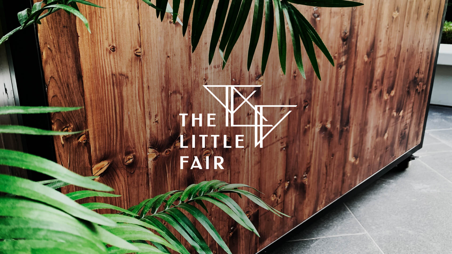
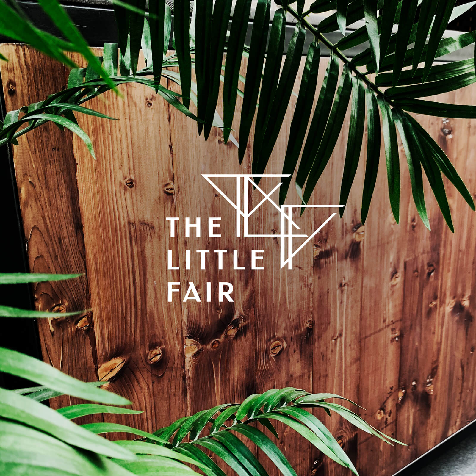
The logo is based upon the vertical and diagonal lines from the brass patterns around the mall, particularly the triangle created at their intersection. The triangle is first placed so that its right-angle vertex is pointing downwards, creating an abstract representation of a ’T’. The triangle is then rotated to create the letter ‘L’ and again further to create the letter ‘F’.
The three triangles interlock on a diagonal angle, the overlapping lines support the character recognition and the double vertical lines emphasise the stems of the letters. The logo text has been customised to follow the same ratio rules in the thick/thin lines of the letters and placed to the lower-left of the lettermark to asymmetrically balance the logo.
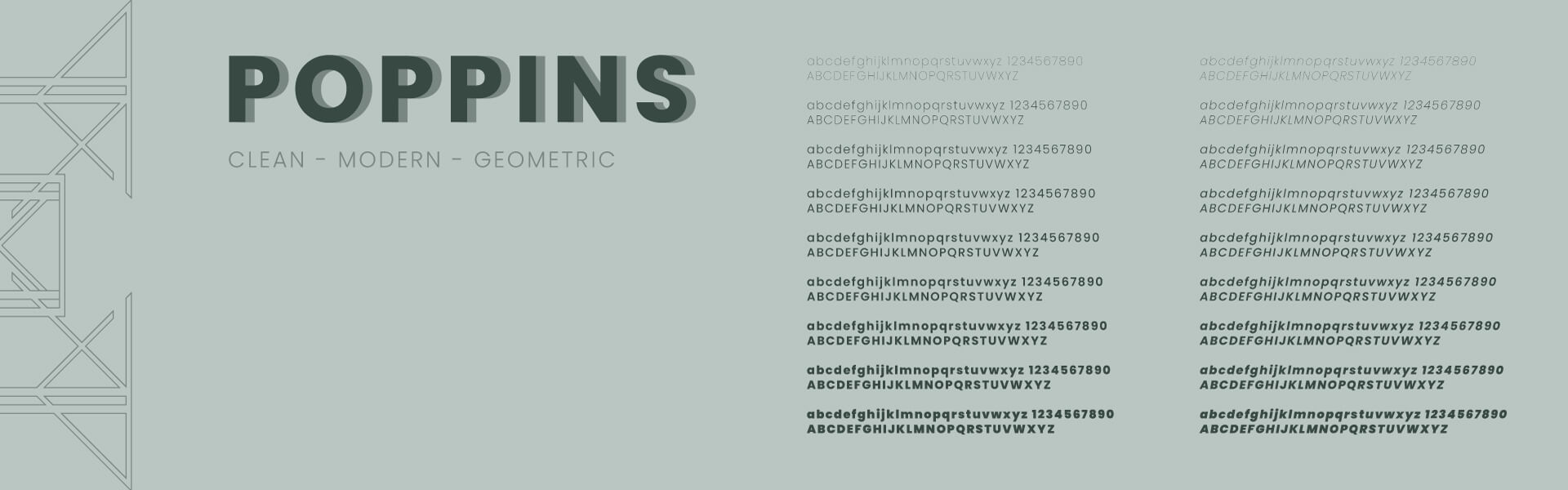
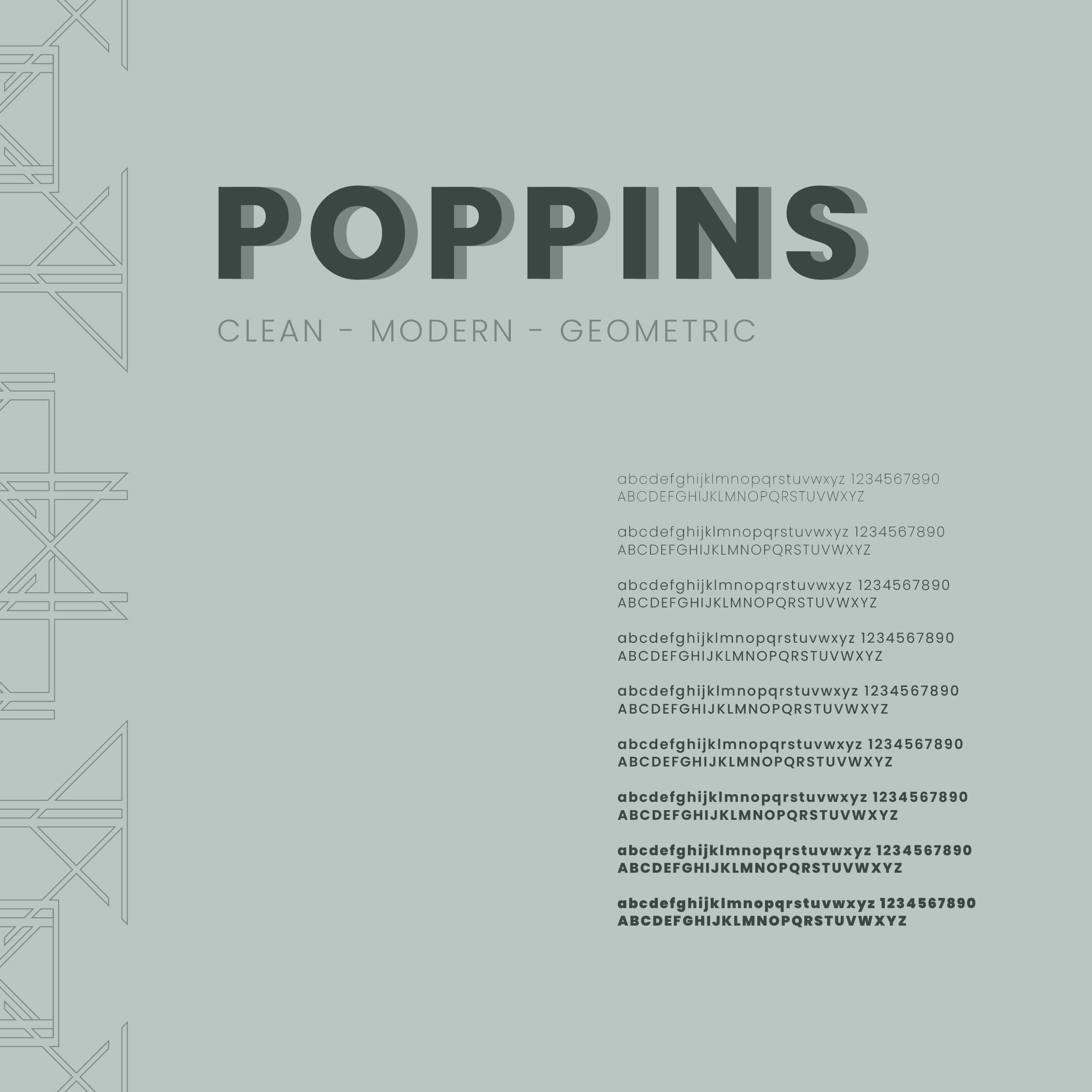
To support the logo throughout its various applications, we wanted to use a font family that offered a range of weights to give us full freedom when designing. Poppins was a clear winner with its clean and modern look, all based around geometric shapes, so tying perfectly in with our theme. As a Google font, there is also added versatility when using it on the web.
The colour palette needed to offer us the same flexibility, so we chose a fairly broad range of colours that could easily be associated with fairs, markets, fêtes, activities, games, fun. These colours were then taken to a more muted tonal range, bringing in references to colour palettes of the past and adding an element of sophistication, again setting it apart.
From the colour palette created, now the core brand colours needed to be assigned. The logo was tested on-screen and on paper over and over again. Adjusting the colours and varying the combinations allowed us to find out which colours worked well and showed us the path towards setting some colour rules; realising quickly that the logo is best seen visually when dark on a lighter background.
Thinking about the colour theory in some depth, the core brand colour was chosen to be a dark green. Green represents nature, organic, growth, positivity, perfectly in keeping with the fair being held in a park and the types of vendors attending. A lighter colour with slightly more blue was added for use as a background colour, representing the sky, fluidity and movement as the fair adapts and changes slightly each week.
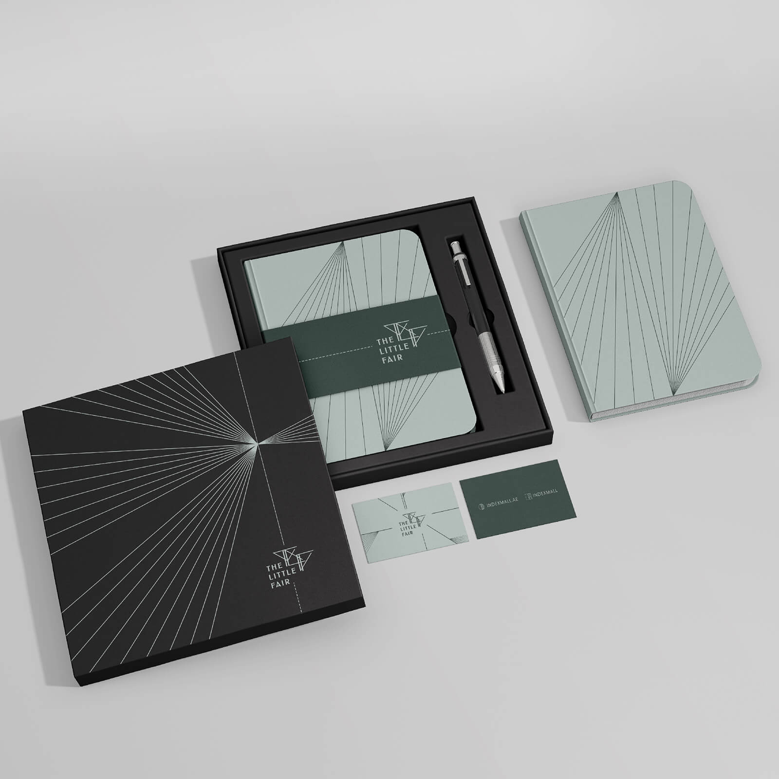
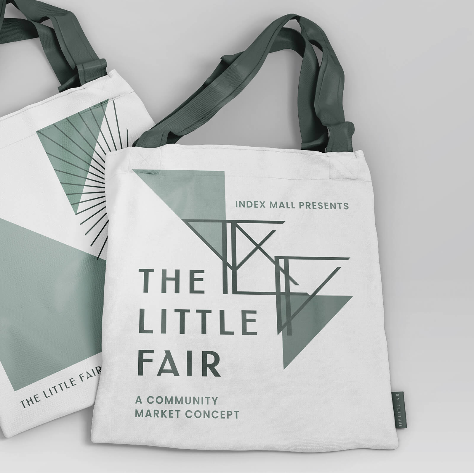
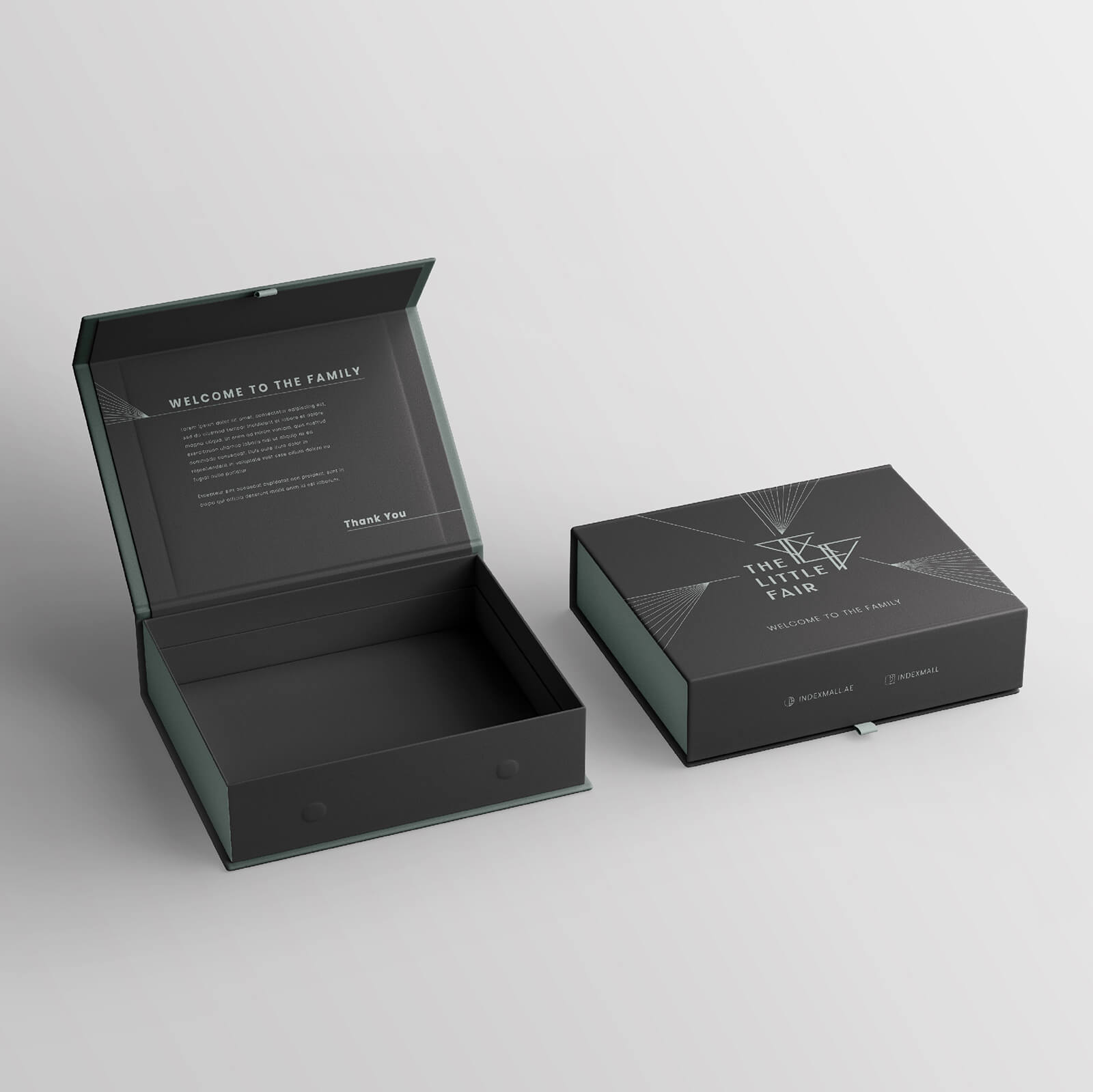
In our early research stages, we had started to create patterns based on the lines and sunburst elements found in the Art Deco period. Taking the brand into a real-world application was enjoyable. We got to play with these elements further while developing the merchandise and using this to bring the brand to life.
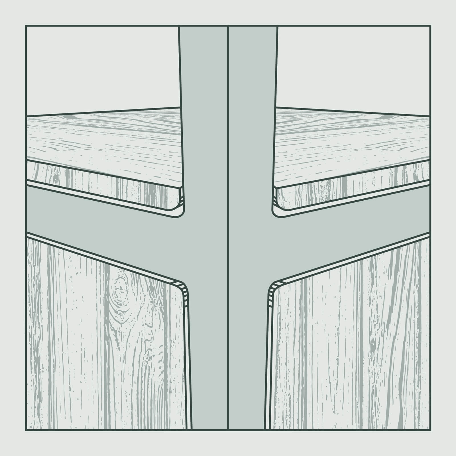
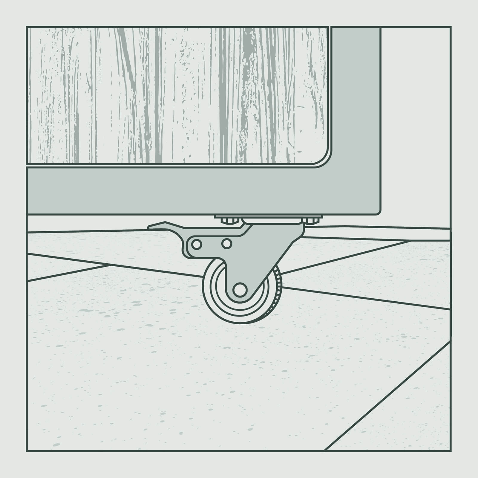
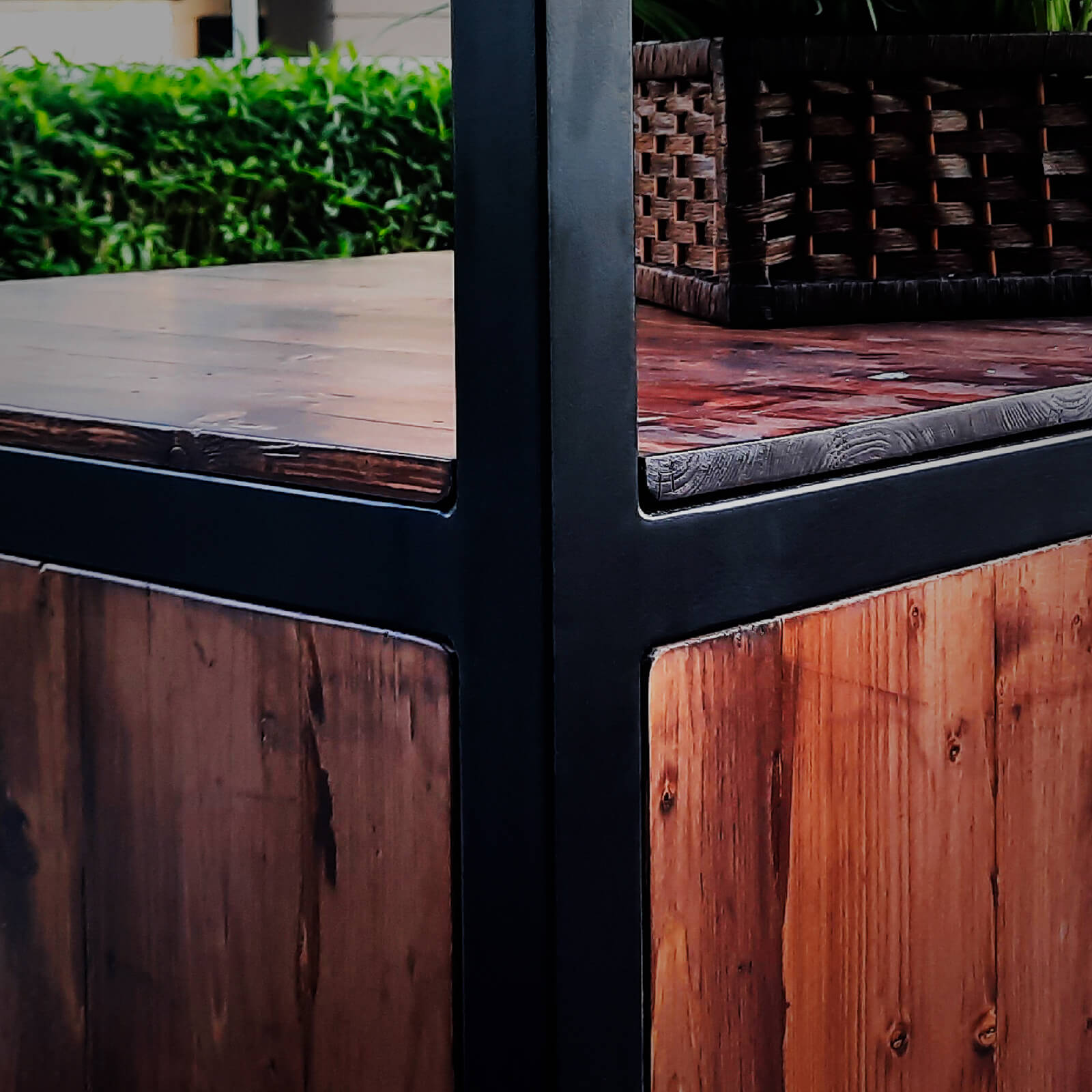

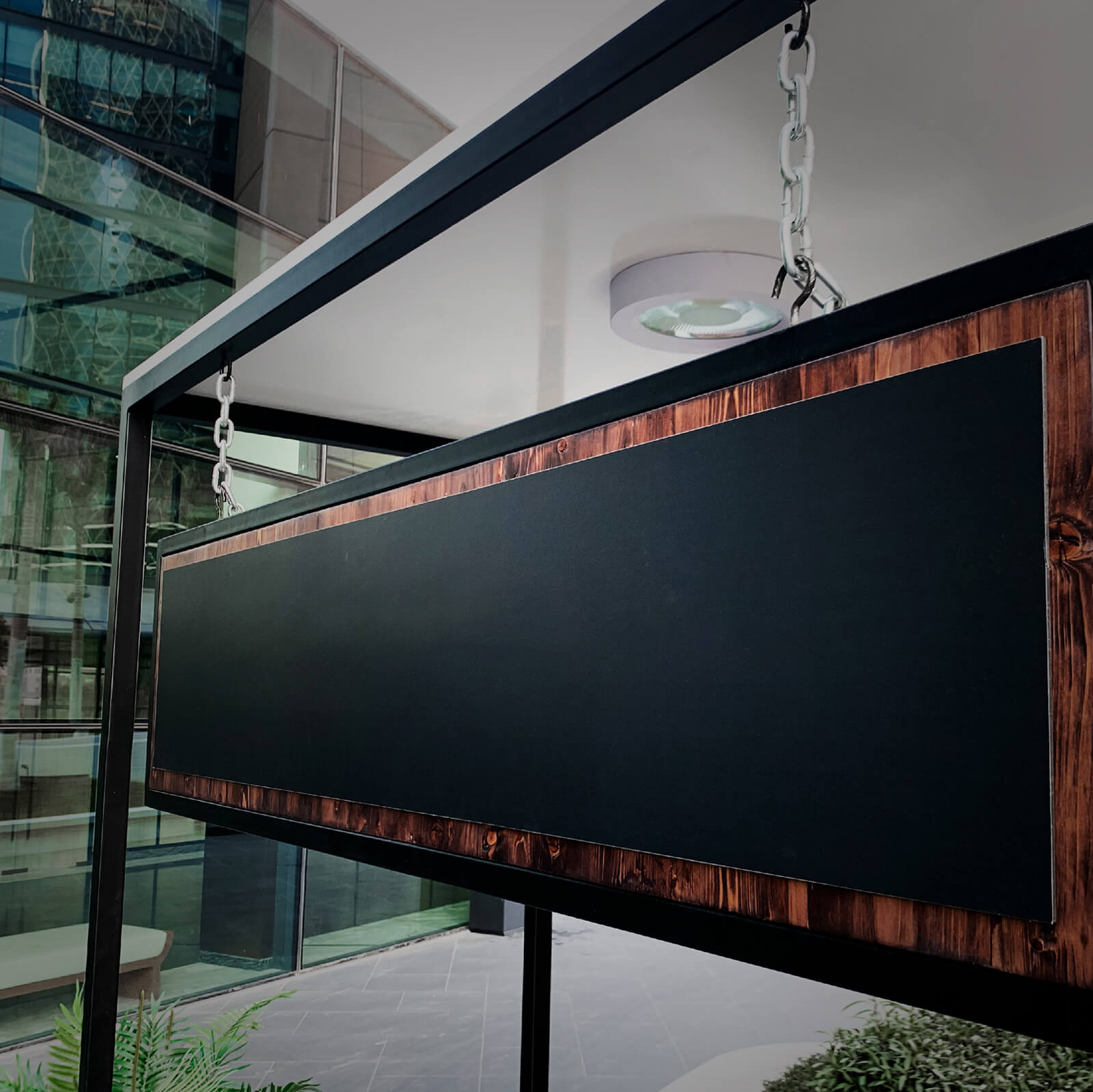
A brand of this calibre deserved to have the best kiosks, something further to set the fair apart from other market competitors. tīmata designed the concept sketches of a few variations based on combining nature with elegance. Working closely with our production team, a custom-designed wood and metal kiosk hit the brief perfectly with the inclusion of lockable storage, inter-changeable signage and smooth-running lockable wheels.
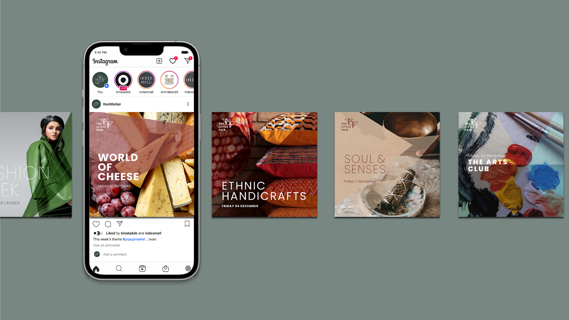
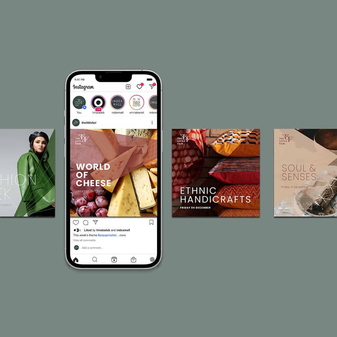
The Little Fair brand will mostly be seen online and used across digital platforms. We created a set styling for the social media look-and-feel as well as any digital displays used to advertise the events, activities and participants of the fair. This is an ongoing task that will see tīmata constantly growing and developing this part as the brand matures.